GBP/USD:
Measuring velocity can be difficult. The accuracy of the measurement is often dependent on what is being measured. Charts as we all know are subject to manual manipulation. This means that altering the view from a minute chart to a daily chart, or increasing or decreasing the time horizon will make the chart appear differently. In the graphs below, one side is a 3yr tenor and the other a 1yr tenor. Compare how vastly different the current time period presents itself between the 2 graphs.

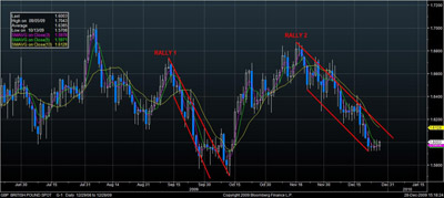
The strongest and easiest trends to trade are those that make consistent average size gains. Analyzing this from the other perspective, the trends that are the most difficult to trade are those that make steep and inconsistent gains. The later, implies volatility and can be very difficult to navigate as most indicators lag behind price action. In the chart below notice the difference in slope between Rallies 1 & 2. The slope is the result of the length of the candles associated with the price action. The longer the candles are, the steeper the slope and the more volatile the price action.
There are many charting tools you can utilize to measure slope or the velocity of price action. For this particular example we utilize the Average True Range (ATR) indicator. The ATR is used to measure volatility. The higher the volatility the higher the ATR will read and vice versa. We also combine our most reliable chart pattern on the ATR to illustrate our point.
In previous graph we illustrated the difference in slope between our current rally and the prior rally. In the chart below we have added the ATR. Recall we began this piece mentioning that simply “eyeballing” the graph can be misleading do to subjective distortions in time and tenor. The ATR will help us place some actual measures around the slope of the rallies.

In Rally 1 the ATR rises for the duration of the rally, suggesting volatility may be moving the market. In the Rally 2, there is a pattern that emerges as the ATR also rises. Notice the higher low to higher high pattern in the ATR section of the chart above. It is common for an ATR to rise in the initial stages of a reversal. After peaking just below .02 it begins to reverse the pattern as volatility levels off and the market begins to accept the new trend. You can observe the ATR making lower highs and lower lows as the overall average begins to wane, implying less volatility in price action. The implication is that this rally is more likely to be sustained as the trend gains constant strength on low volatility.